Mixing patterns is a great way to add a personal touch to any room, by picking your favourite fabrics and making the patterns work together. It can seem a bit daunting at first, choosing the colour, size and type of prints to use, but don’t be afraid to give it a go! From wallpaper to cushions, patterns can work in any room of the house, adding colour and personality. Here are some quick tips on how to mix patterns like a Pro!
1. Start with Three
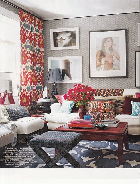
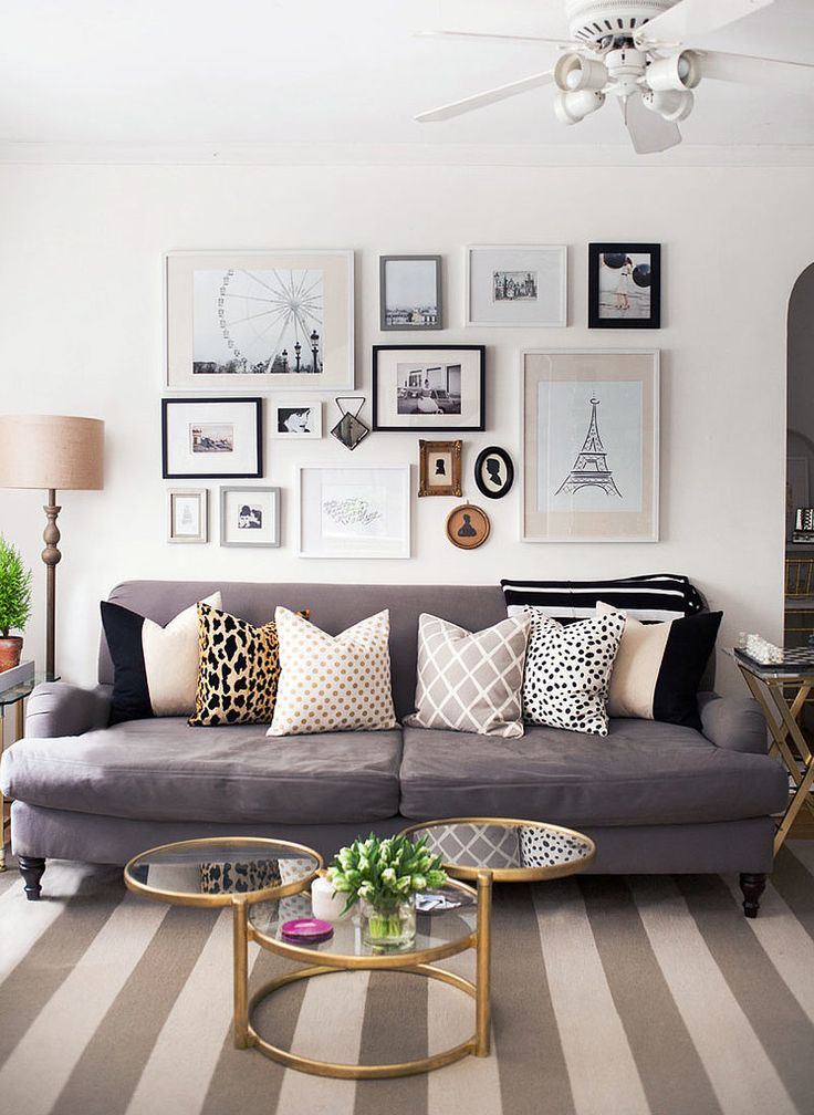
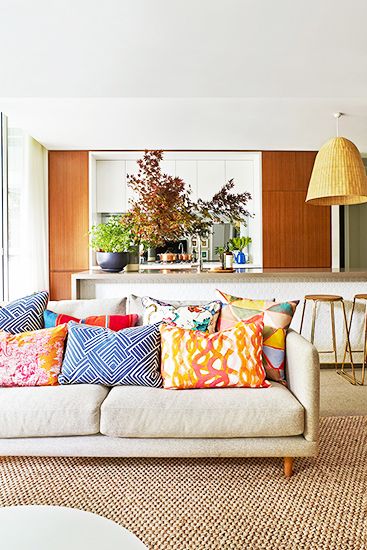
Three different patterns is a good place to start! Its not too overwhelming finding three different prints to mix and match and once you have started with three its easy to incorporate a couple more into the mix. Just stick to a few guidelines and you can’t go wrong!

2. Its all about Scale
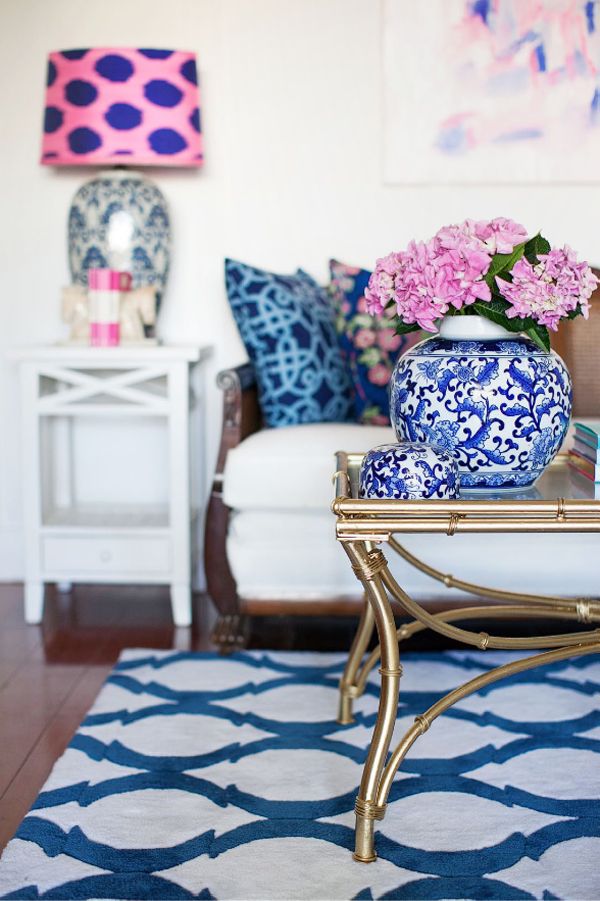
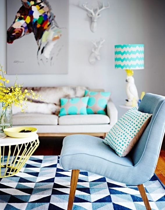
When mixing patterns scale is an important part of making it work. The best tip to follow is too choose one large, bold print and mix it with medium and small prints. Mixing all large prints just makes the patterns clash.
3. Mix with Neutrals
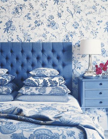
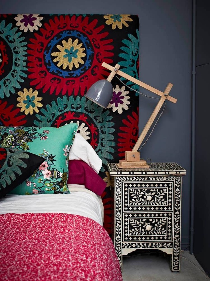
Its a great idea to mix some neutrals in with the patterns. Neutrals add a another colour or element while still letting the prints shine. Often it actually works to use stripes as a ‘neutral’, they aren’t too bold and can compliment most prints perfectly.
4. Colour Control
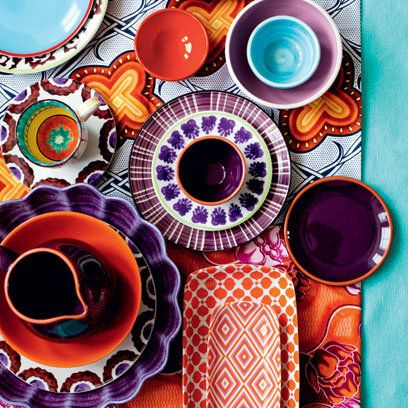
Choosing the right colour combination when mixing patterns is probably the most important element to get right. There are some simple things to remember when choosing colours. Always keep the colours to the same intensity, for example it works better to mix pastels with pastels and bold colours with bold colours. The mix of prints is busy enough without clashing colour tones, so let the prints take centre stage.


5. Take a Risk!
Mixing patterns perfectly means taking a risk! Sometimes if it doesn’t ‘match’ it actually works perfectly, don’t be afraid to play around with different combinations of patterns that you initially don’t think will work. Often you will be surprised by which patterns work and which don’t.

 (All images via Pinterest)