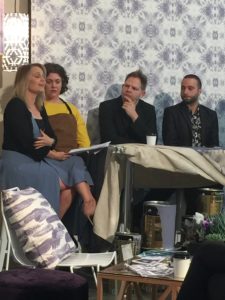
Last Monday, we were fortunate to be invited to Tim Robinson’s Photography studio where leading Australian paint brand Taubmans, unveiled its inaugural Taubmans Colour of the Year 2017, Violet Verbena.
The guest panel explored all of our senses, our reasons for reacting to colour and what’s behind our natural attraction to Violet Verbena. Dr Lisa Cooper florist and artist, Grace Garrett textile designer and educator, celebrity psychic medium Harry T, chef Nelly Robinson and DJ Charlie Obrien who, especially for the occasion, composed music inspired by the colour and singer Prince (the most famous ambassador for shades of purple with “Purple Rain”).
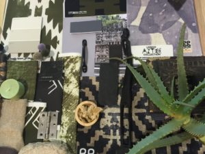
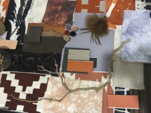
There were mood boards, fabric swatches and cushions made by Grace Garrett, violet coloured sweets containing surprise pops of tangy liquid by Nelly, and amethysts handed to us by Harry T, while he explained the Crown Chakra, which happens to be violet!
Violet Verbena is a unique greyed-off moody purple that allows it to adapt to surrounding environments and complement a variety of design aesthetics. When paired with dark neutrals, it unveils grey undertones, but when paired with whites, it reads as a purer purple. Not masculine, nor feminine, the colour swings fabulously between the two – masculine with blacks, dark woods and greys. Feminine with florals, pinks, pastels and whites AND totally faultless with grey/white marble.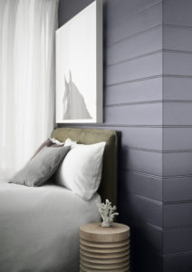
The colour was unanimously selected by PPG as an emerging colour trend, for its distinctive qualities and the rise of this shade on the runway in fashion, textiles, technology, automotive and in commercial and residential segments. PPG is the colour leader in multiple industries with global colour experts.
Shaynna Blaze, Interiors design expert and Taubmans Brand Ambassador, says: “I love the Taubmans Colour of the Year 2017, Violet Verbena, for its clever chameleon-like qualities. It’s the new neutral – a warm grey tone that plays in its environment and blends perfectly with many different surroundings. It’s polished yet playful in a child’s room but calming enough to be used in hospitals or other spaces that require tranquility.
To me it feels simultaneously nostalgic and modern, both masculine and feminine, and is very reflective of where design is heading in 2017.”
So what are Shaynna’s top 3 tips on incorporating Taubmans Violet Verbena in your home?
1. Violet Verbena is an elegant foray into a contemporary purple hue which sits nicely alongside indigo and the mixed metal tones such as brass, copper and rose gold
2. Violet Verbena colour will work seamlessly with exteriors and interiors. It’s a modern choice for interiors and furnishings, yet elegant enough to be incorporated into traditional designs
3. Violet Verbena is a new player in the neutral palette. At quarter or half-strength it is mutable enough to compliment most decors but at full or double-strength it becomes a feature

Nadine Miller-Vachon from PPG added “We’re thrilled to launch the inaugural Taubmans Colour of the Year 2017. It’s a unique colour which can work in a range of different applications so we hope it inspires people to feel confident with colour.”
Taubmans offers more than 5,700 paint choice colours!
For more information, online tools and inspiration visit: http://www.taubmans.com.au #TaubmansCOTY
We hope this inspires you to get started. So #LetsGoPaint and if you are worried about selecting the perfect colour for your space, just leave your details here and we’ll call you.
The Belindas xx
Have something to add? Please do so in the comments.
(PS. This is not a sponsored post)