Each year Pantone picks a colour of the year. This colour is then used throughout different industries and aesthetics, such as décor, fashion and print. Pantone are a leading authority on colour and provider of colour matching systems, they provide accurate colour communication across industries. This year Pantone has chosen two colours as colour of the year, Rose Quartz and Serenity. These are the colours we will see popping up everywhere from fashion to décor!
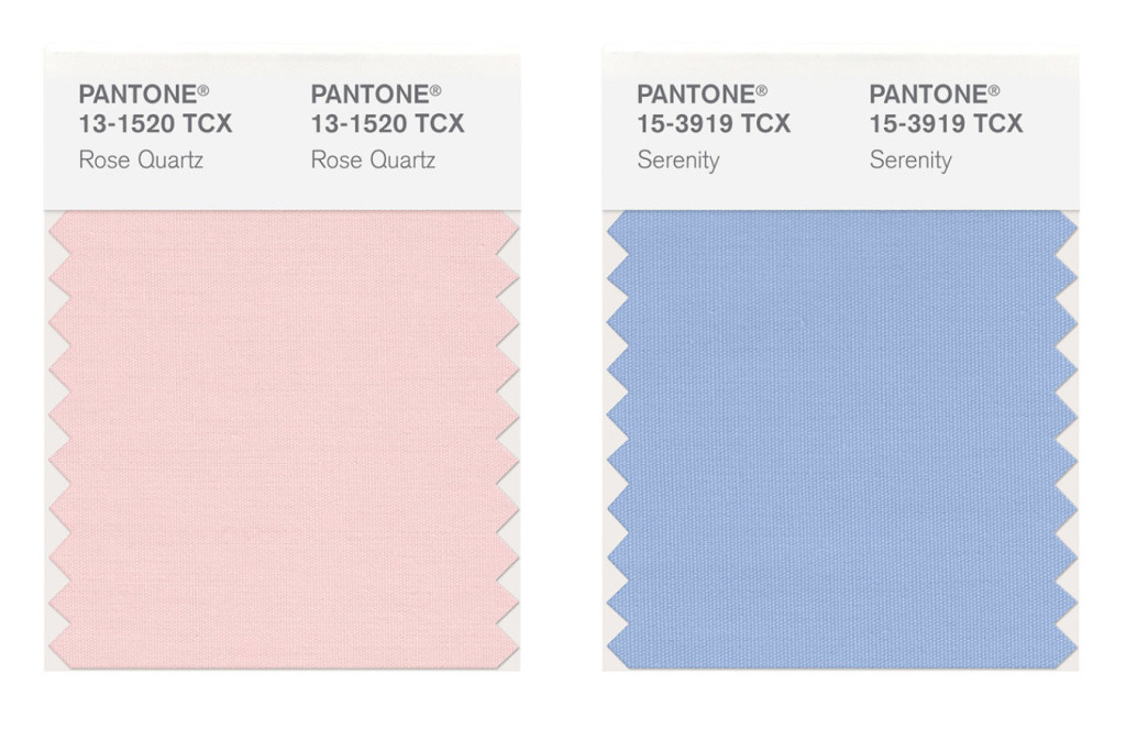
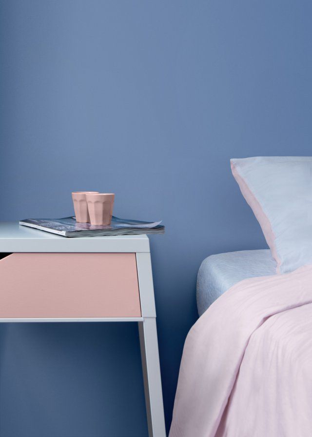
Rose quartz is a warm shade of pink that adds a sense of romance to décor. It’s a soft dusky pink that is welcoming and not too bold. Serenity is a soft shade of blue that adds a sense of calm and tranquillity to a room. Pantone presents Rose Quartz and Serenity as a combination of colour of the year, two separate colours that are also joined together. They compliment each other, working together as a colour palette, while also being great colours to use separately.


Rose Quartz
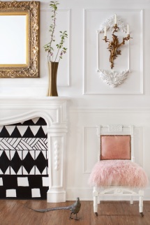
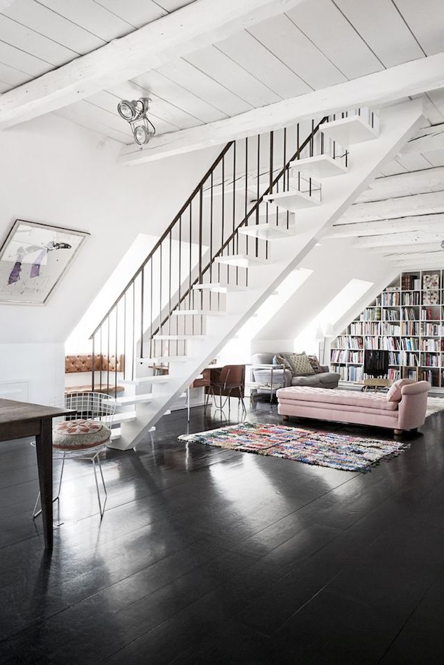
Rose Quartz is a romantic faded pink that may seem like a risky choice for home décor, but if used the right way it can be quite a neutral colour.
- Add just a touch of pink in the room, instead of painting a whole wall, this is a safe way to add the colour to your décor. Think cushions, accessories or a single piece of furniture.
- Use Rose Quartz with geometric prints and black and white to keep it current and on trend.
- If you are using rose quartz in a piece of furniture, such as an arm chair or lounge, choose a modern shape and simple lines to keep the colour choice up to date.
- This is a great colour for adding a cosy, romantic feel to room. Add it to a room that might need a lift.
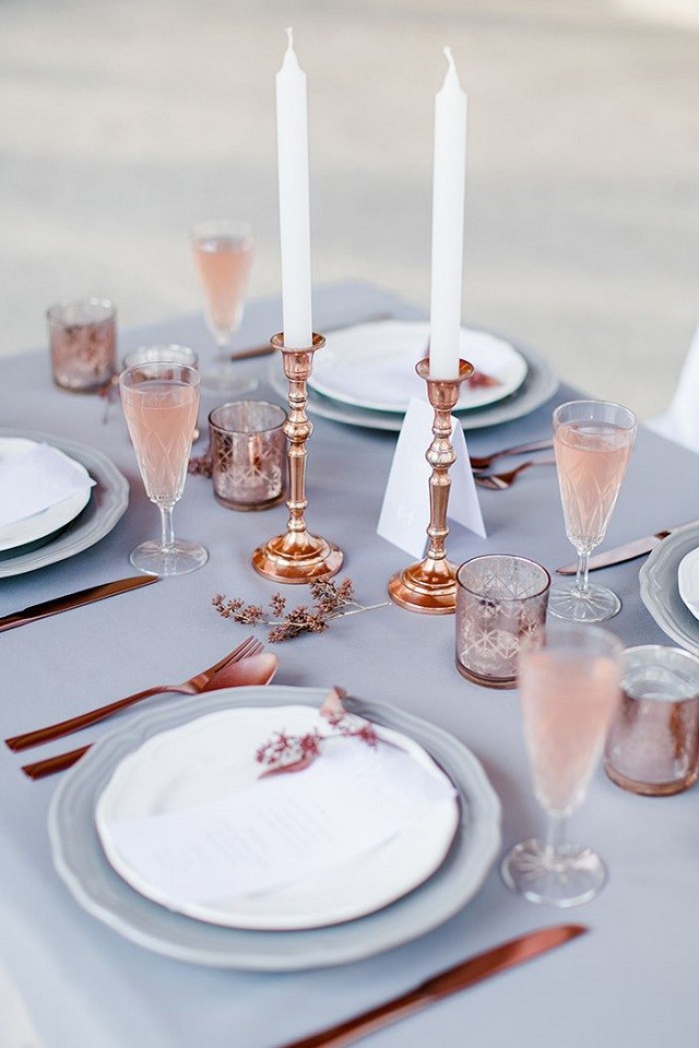
- Rose quartz also looks great mixed with white and neutrals, pink tones mixed with white cushions or bed linen looks great.


Serenity
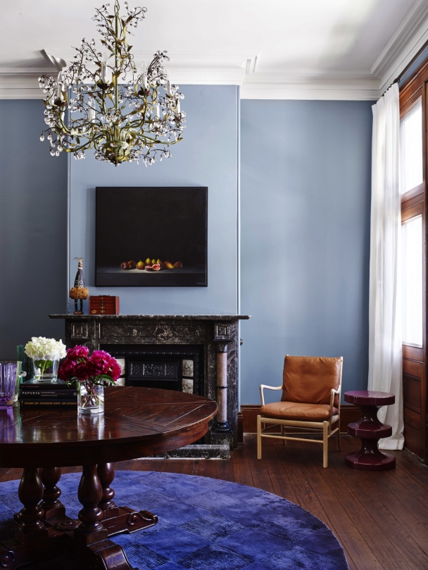
Serenity is a calming shade of blue that can add a sense of tranquillity to your décor. It may look like a ‘baby blue’ but it doesn’t have to be used in a nursery. Blue tones can work perfectly in any room and with many different décor styles.
- Use blue tones, like Serenity, in a room to add a calming feel. It is a colour reminiscent of the ocean, so works perfectly in coastal homes.
- Mix with other tones of blue for a an easy way to add tone and richness to a room. Think navy and indigos.
- If you don’t want to commit to painting walls in blue, add soft accessories in different textures and tones of blue to add a pop of colour to your home.
- Serenity is a tone that works well with neutrals, metallic and pastels. It works surprisingly well with Rose Quartz and other tones of pink!


Have something to add? Tell us in the comments!