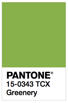
Many in the design world take inspiration from Pantone’s colour of the year, in interiors, fashion and graphics. The Pantone colour of 2017 has just been announced as Greenery, a zesty, vibrant shade of green, with this announcement:
“A refreshing and revitalizing shade, Greenery is symbolic of new beginnings.
Greenery is a fresh and zesty yellow-green shade that evokes the first days of spring when nature’s greens revive, restore and renew. Illustrative of flourishing foliage and the lushness of the great outdoors, the fortifying attributes of Greenery signals consumers to take a deep breath, oxygenate and reinvigorate.
Greenery is nature’s neutral. The more submerged people are in modern life, the greater their innate craving to immerse themselves in the physical beauty and inherent unity of the natural world. This shift is reflected by the proliferation of all things expressive of Greenery in daily lives through urban planning, architecture, lifestyle and design choices globally. A constant on the periphery, Greenery is now being pulled to the forefront – it is an omnipresent hue around the world.
A life-affirming shade, Greenery is also emblematic of the pursuit of personal passions and vitality.”
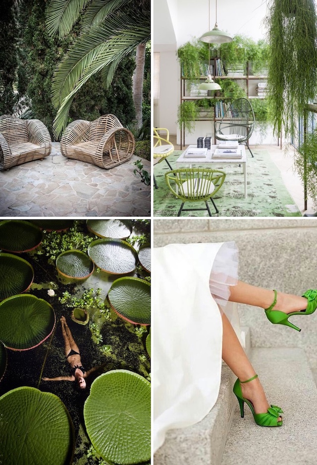
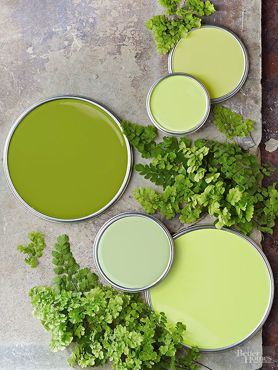
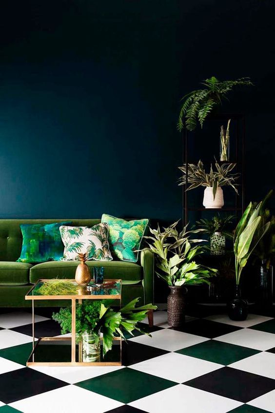
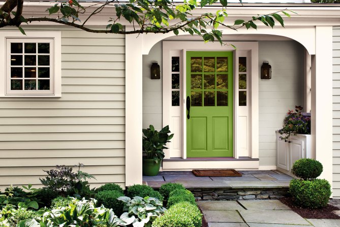
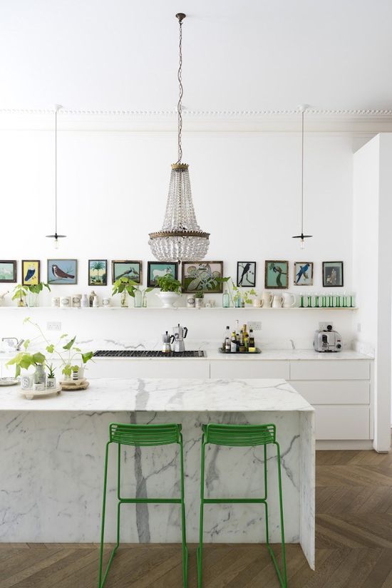
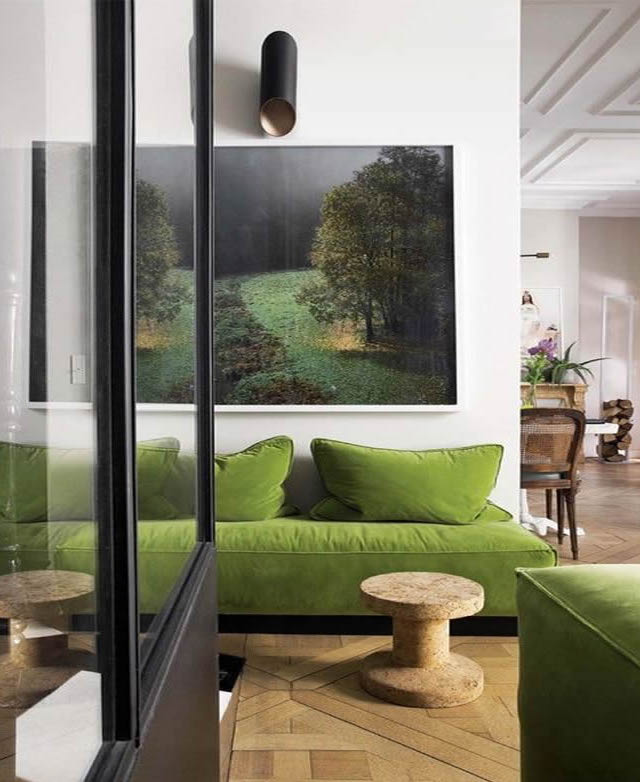
This vibrant green works surprisingly well with a wide array of colours, including neutral, brights and darker hues. It might be a colour that is hard to introduce into your current colour scheme on a large scale, so the best way to easily incorporate it into your home is to add some indoor plants! It might seem simple, but adding some indoor plants in this vibrant green colour, will make an impact. ‘Greenery’ is a big colour and will quickly become the hero of your room, so use it wisely among your favourite neutrals. Take a nod to the 70’s and a little inspiration from Pantone’s colour of the year and introduce ‘Greenery’ into your home!
Images: 1 / 2 / 3 / 4 / 5 / 6 / 7